HomeServicesAboutCareersBlogsResearchCase StudiesContact Start a project
Retail

Enhancing User Interface for a Seamless Multi-step Checkout Experience

Product UI illustration of a multi-step checkout with a pay button

The challenge

A retail business was losing customers at the finish line. Its multi-step checkout was confusing — unclear progress, too many fields, and friction on mobile — causing shoppers to abandon carts before completing a purchase.

Our approach

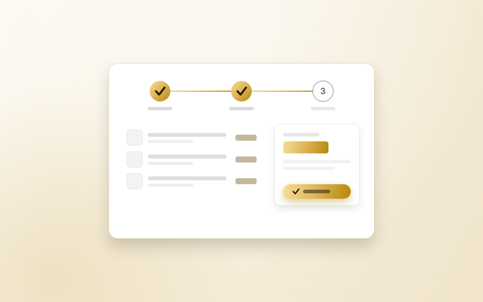
We redesigned the checkout around clarity and momentum:

  • Ran research to pinpoint exactly where and why users dropped off.
  • Simplified the flow, removing unnecessary steps and fields.
  • Added a clear progress indicator so shoppers always knew where they were.
  • Designed mobile-first with inline validation to prevent errors.
The best checkout is one customers barely notice — it just works.

The results

The checkout became smooth and reassuring instead of confusing. With friction removed and progress made obvious, more shoppers completed their purchase and the experience finally matched the quality of the products.

Back to all case studies

Let's write your success story next.

Start a project